

Key word : SENSITIVITY ANALYSIS, TORNADO, QUANTITATIVE
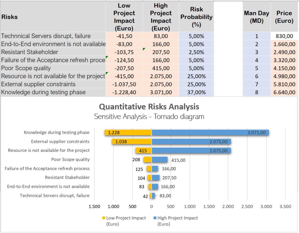
Sensitivity Analysis : This is a technique and the goal is to determine which are the risks that impact the most the project.
What is a Tornado diagram : This is a special bar chart used in the Sensitivity Analysis. This diagram is used to compare the importance of different variables. In this chart, the data Categories are listed vertically instead of the standard horizontal presentation. The Categories are ordered so that the largest bar appears at the top of the chart, the second largest appears second from the top, and so on.
Why do we use Tornados Diagrams ? : They are useful for comparing the relative importance of variables. For each variable/uncertainty considered, you will need estimates for what the low, base, and high outcomes would be. The sensitive variable is modeled as uncertain value while all other variables are held at baseline values (stable). ,